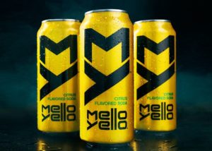
Mello Yello has a new look courtesy of United Dsn in San Francisco. “The new design, described as “bold and unapologetic,” features a vertically-scripted black “MY” logo across vibrant yellow packaging, and silver “MY” on black packaging for Mello Yello Zero.” I would say it’s a BAD ASS redesign! Here is the Graphic Design USA article: http://gdusa.com/packaging/mello-yello-design-anything-but-mellow
Welcome to the JDGD blog, where we share news, resources, and ideas on design!
Categories
- Advertising (1)
- AIGA (17)
- AIGA Medalist (1)
- Apple (8)
- Awards (13)
- Best of 2015 (1)
- branding (3)
- Business practices (5)
- Chesterfield County (1)
- Community (3)
- Design Thinking (2)
- Designer (6)
- entrepreneur (3)
- Facebook (1)
- Google (4)
- Graphic Design (7)
- Graphics (2)
- Logo Design (14)
- Marketing (6)
- non-profit (1)
- Paul Rand (2)
- Richmond (9)
- SEO (3)
- Speakers (5)
- Steve Jobs (1)
- Trends (3)
- Uncategorized (7)
- Website design (5)
- Workshops (5)
- world wide web (2)

